Improving your digital presence is an adventure. Let us guide you through it.
Contact us using the form below and one of our team members will reach out as soon as possible.
(*) - Required field

Alt Media Studios can help you design your brand and blend it seamlessly into your marketing campaign. Read how we did that for Pronto Restaurant Insurance.
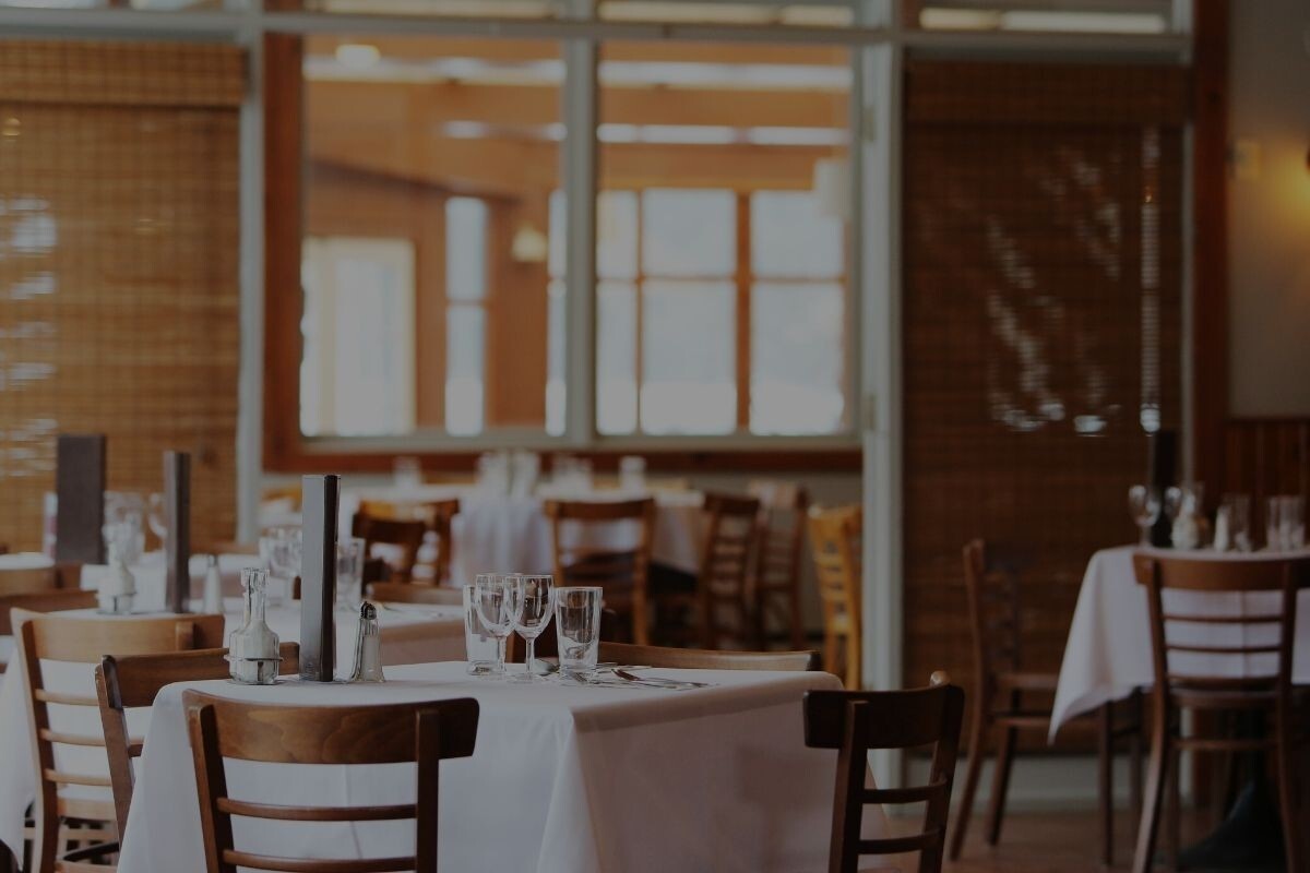
Italy. Mountain biking. Restaurant insurance. After meeting with DiFranco Insurance to discuss their newest venture, we knew these dissimilar interests would need to mesh seamlessly in their marketing campaign. Yes, they would need an effective and easy-to-navigate website, a clean logo, and a tight marketing strategy. But they also wanted the personal touches to shine through.
Anyone looking to establish a new brand will need a few staples in their arsenal:
In the case of Pronto, the owner already had some strong feelings about the name and had previously purchased a domain – insurepronto.com. This decision set the ball in motion and gave our team a path to follow. Next, we set to work on other components, always focused on keeping things consistent.
When the client offered insurepronto.com as the domain name, we thought that it was a great option. When we hear the word “pronto” we know things are getting done quickly. And what insurance customer isn’t looking for speedy and efficient service? “Pronto” also has close ties with the culinary world––for a company offering insurance coverage to restaurants, it was a perfect name. And so Pronto Restaurant Insurance was born.
A mountain biking enthusiast, the company owner really wanted to see two shades of orange and blue––specific to his favorite bike––weave through the logo and overall website scheme. Thankfully the colors were naturally complementary and pretty modern, so this wasn’t hard. With any client, our goal is to land on a color scheme that not only suits the company, but is also pleasantly eye-catching.
We also wanted to show the connection between Pronto Insurance and DiFranco, so the Pronto logo incorporated design aspects that are shared with DiFranco’s. And when it comes to illustrating protection, a shield conveys the idea perfectly. We ended up with a clean, simple logo design that conveyed a clear message: Pronto protects.

As the logo was being designed, our team was also working on keyword-rich, relevant content. We decided to begin padding the site with articles that could answer the basic questions that a company in need of restaurant insurance might have. So we did some research, found accurate details and statistics, and composed four main articles. Besides being of interest to potential clients, the articles also needed to be relatable. So they were written in a way that appeals to readers. Natural language also boosts search engine ranking and is easily shared on social media channels.
We will continue to add more specified content, but from the beginning we knew that we needed to answer the big questions first. The available content will give the reader a sense that there’s more to restaurant insurance than initially meets the eye. And here’s the best part: Pronto will be established as an expert and a great resource for clients.

Once the name, logo, and domain were decided and content was ready, the website could be built. We drew on the chosen colors and the modern, simple lines of the logo to inform how we designed the site. Its purpose needed to be clear and client access to information was to be quick and easy. So we made sure that there were obvious ways to get in touch with the company, to get a quote, or to read relevant content. We also built features into the site that will allow us to analyze data coming in from customer leads and make it easy to respond. Once social media channels are developed, they’ll also be linked on the site and be a great way to engage with clients.
The visible parts of the brand were finished, and Pronto also chose to run ads for restaurant insurance. Now potential clients are getting interested––how can Pronto track results? We incorporated some smart tracking mechanisms into the foundation of Pronto’s website. CallRail is an application that is able to track whether calls come in via organic searches, by clients going directly to the site, or due to ads. We can use this tool to inform the client about their most productive marketing options. This way, a company can make the best initial use of available assets and as business grows, they’ll know where to send more cash.
All in all, we find Pronto’s evolution to be an ideal case study. The process we went through highlights the interactive nature of developing a company’s brand. It took some creativity to get the details right, but that coalescence is what we strive for. When customers are happy, it affects the design team. And when the design is cohesive, it leads to a more seamless launch––that’s something customers can feel. But it’s a delicate mix. If a brand isn’t allowed to not be true to itself, or if designers have to deal with client inflexibility, things won’t run smoothly. But if needs and goals are the first priority, that will keep everyone focused and hopefully bring an end result as good as we saw with Pronto.
As you’ve seen from this case study, there’s a lot that goes into each job. With so many moving parts and areas of expertise at play, it’s more important than ever to partner with a professional. So when you decide to launch your new brand, think of Alt Media. We’d be honored to be part of your company’s growth and are always ready to help. Reach out today!

Learn how our web app developers helped a client save a big account with a custom-designed web application.

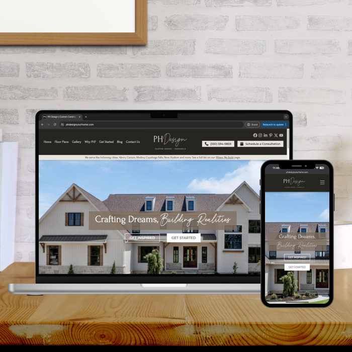
Our client was in need of a modernized website and updated branding that truly exemplified their level of professionalism and expertise in custom home building. Here’s how we exceeded expectations.

Find out how we helped our client capitalize on sales opportunities for dramatic increases and gains.