Improving your digital presence is an adventure. Let us guide you through it.
Contact us using the form below and one of our team members will reach out as soon as possible.
(*) - Required field

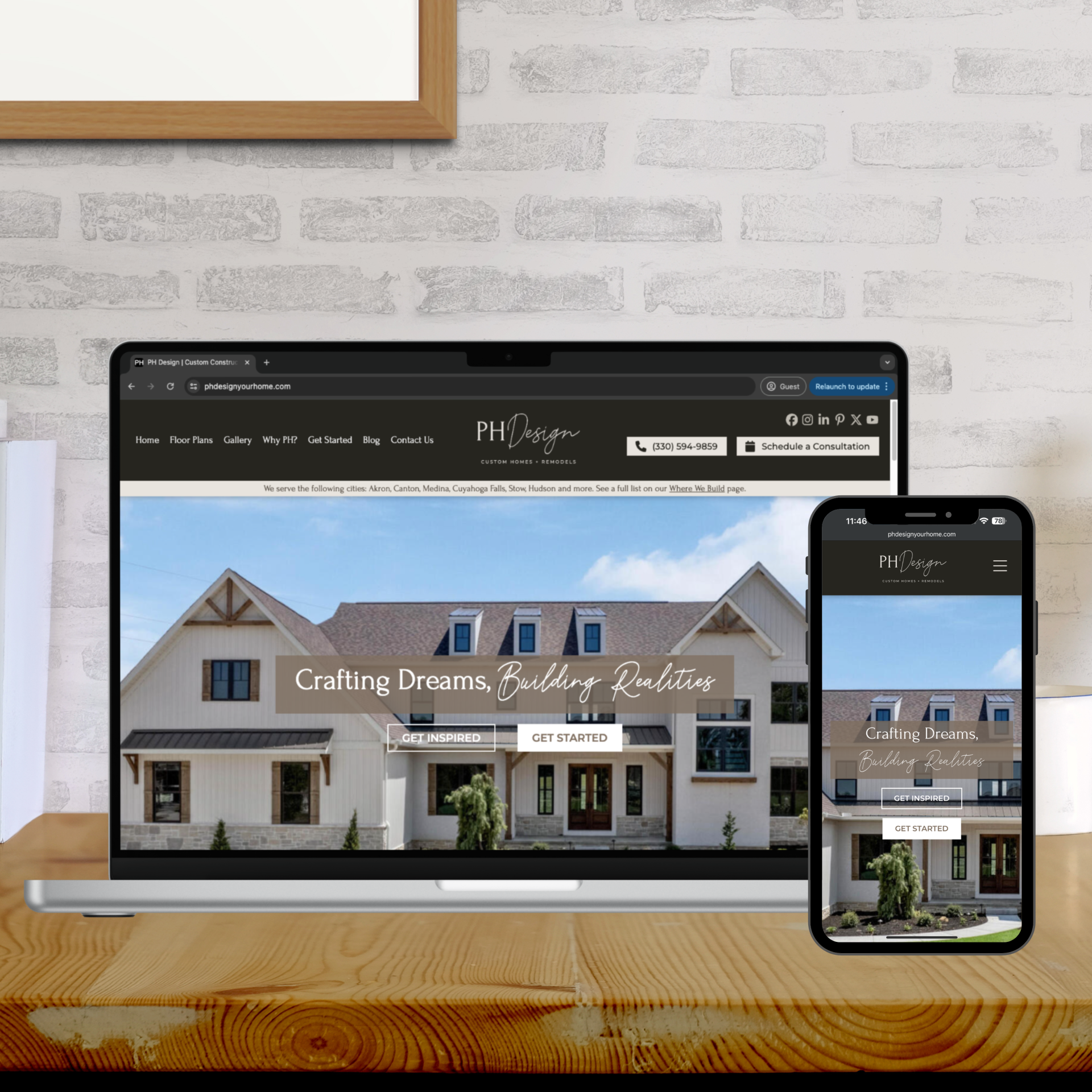
Our client was in need of a modernized website and updated branding that truly exemplified their level of professionalism and expertise in custom home building. Here’s how we exceeded expectations.
Learn how AMST reworked our client’s branding to create a top-of-the line website to match their style and to help market their exquisite and luxurious custom-built homes.
Our client was in need of a modernized website and updated branding that truly exemplified their level of professionalism and expertise in custom home building. Here’s how we exceeded expectations.
Our client, a luxury custom homebuilder in Northeast Ohio, had worked with us for several years. During this time, we all knew that a website redesign was desperately needed to keep up with the standards of the homes they were producing. The time finally came to get to work and turn their goals into reality.
We consulted with our client and naturally, given that they focus on design, they had some inspiration and some basic ideas that they sent our way. We picked up those prompts and ran with them. Our team of designers and web development pros worked together to get every aspect of the new website looking pristine. From the color palette to the ideal font and the right vibes, we handled everything.
Once we had a good idea of what we could achieve for our client, we created a mockup of the website for their review. This allowed the client to visualize their new site and enabled us to get vital feedback to ensure that we could refine the design and stay on track with the launch.

We already had a well-developed relationship with our client, so it was easy to keep in touch at every step of the process. Once we got their final input, we set to work and implemented any preferences. In the end, we facilitated a total logo and color palette change and made our client’s website layout more modern. Their high-end website now matches the high-end homes they build. Our customer was as thrilled as we were with the final product, and said, “We love the new look!” We’ll second that notion!
This was a standard redesign in some ways, but in others it was, of course, the unique flower that every client website is. For us, the key takeaway from this project is how important it is to build a relationship with clients, and in turn, for clients to be open to relationship building with us.
When we decided that a website, logo, and branding update were on the table, we already knew these were eventual changes that our client wanted to make. We already had ideas. The stage was set for us to pull the trigger and get down to business, flexing our web design and brand design muscles to the most nuanced detail, ensuring that the final product perfectly reflected what our client was hoping to achieve. We accomplished this and more. But it’s not just skill that got us here–it’s also because of good relationships established over years of working together that this project was such a smooth success.
So what’s our message to potential and current clients? Let’s build a relationship, folks. When we’re both responsive and open to discussion, great things (like this amazing website!) can result. Get in touch with our team today to learn how we can make our web design skills and custom graphic design services work for you!

Learn how our web app developers helped a client save a big account with a custom-designed web application.

Find out how we helped our client capitalize on sales opportunities for dramatic increases and gains.

Discover how a Northeast Ohio medical provider transformed its online presence with a comprehensive branding redesign and a modern, user-friendly website, setting a new standard for patient engagement and streamlined communication.